Nobody Could Use Our ML Engine.
Lead Product Designer (End-to-End Ownership)Cloud Software Group — WebFOCUS • Jan 2023 – Jan 2025
While deep in ReportCaster, the principal data scientist handed me a side challenge — an explainability popup. I nailed it, and that earned the trust to own the entire ML workflow redesign. Here's what I walked into, and how it all started.
Zero ML background. I asked my data scientist questions. I asked AI questions. I researched binary classification, regression, random forest, neural networks — whatever I needed. Eventually that pushed me into taking an MIT course. I paid for it myself because the work had outgrown surface-level understanding.
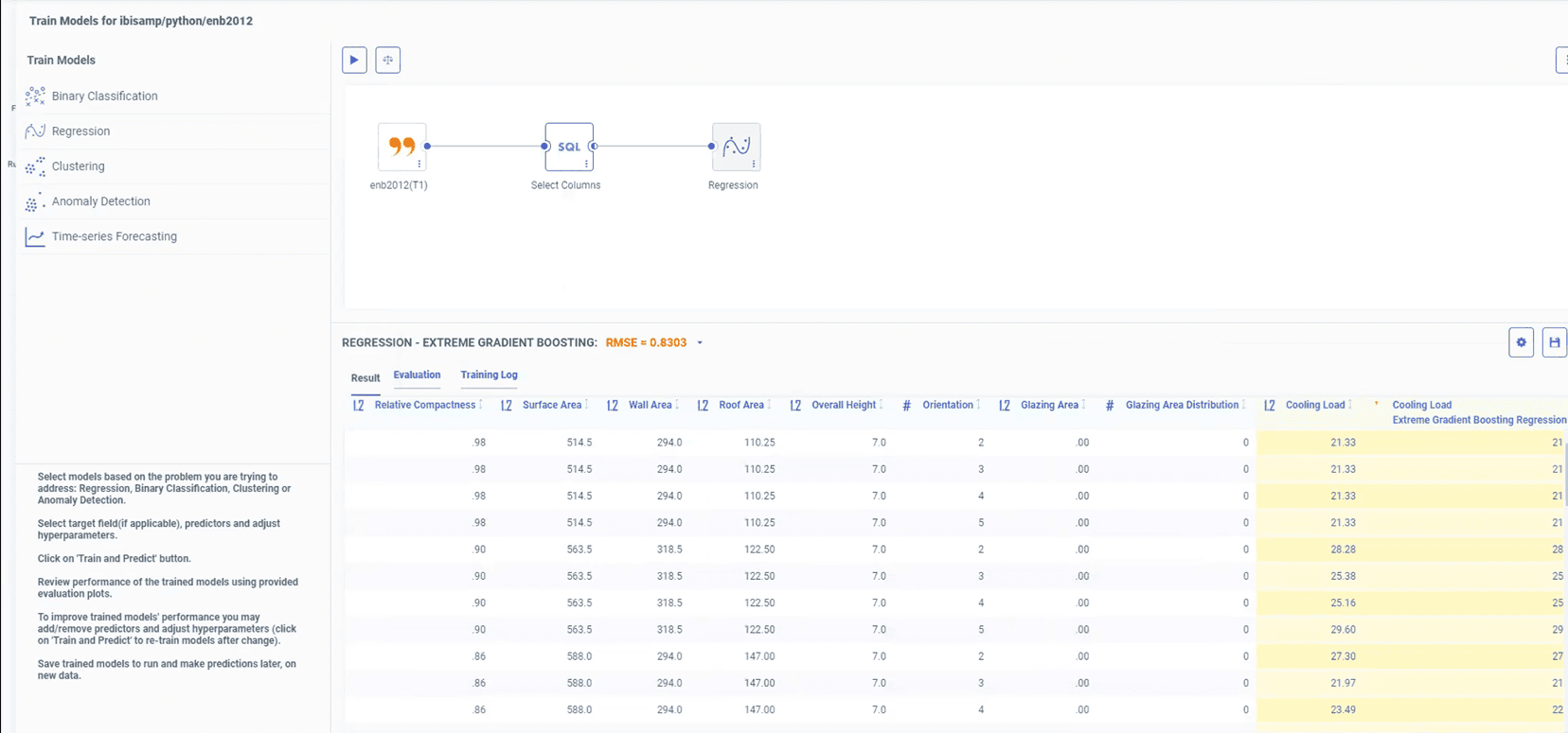
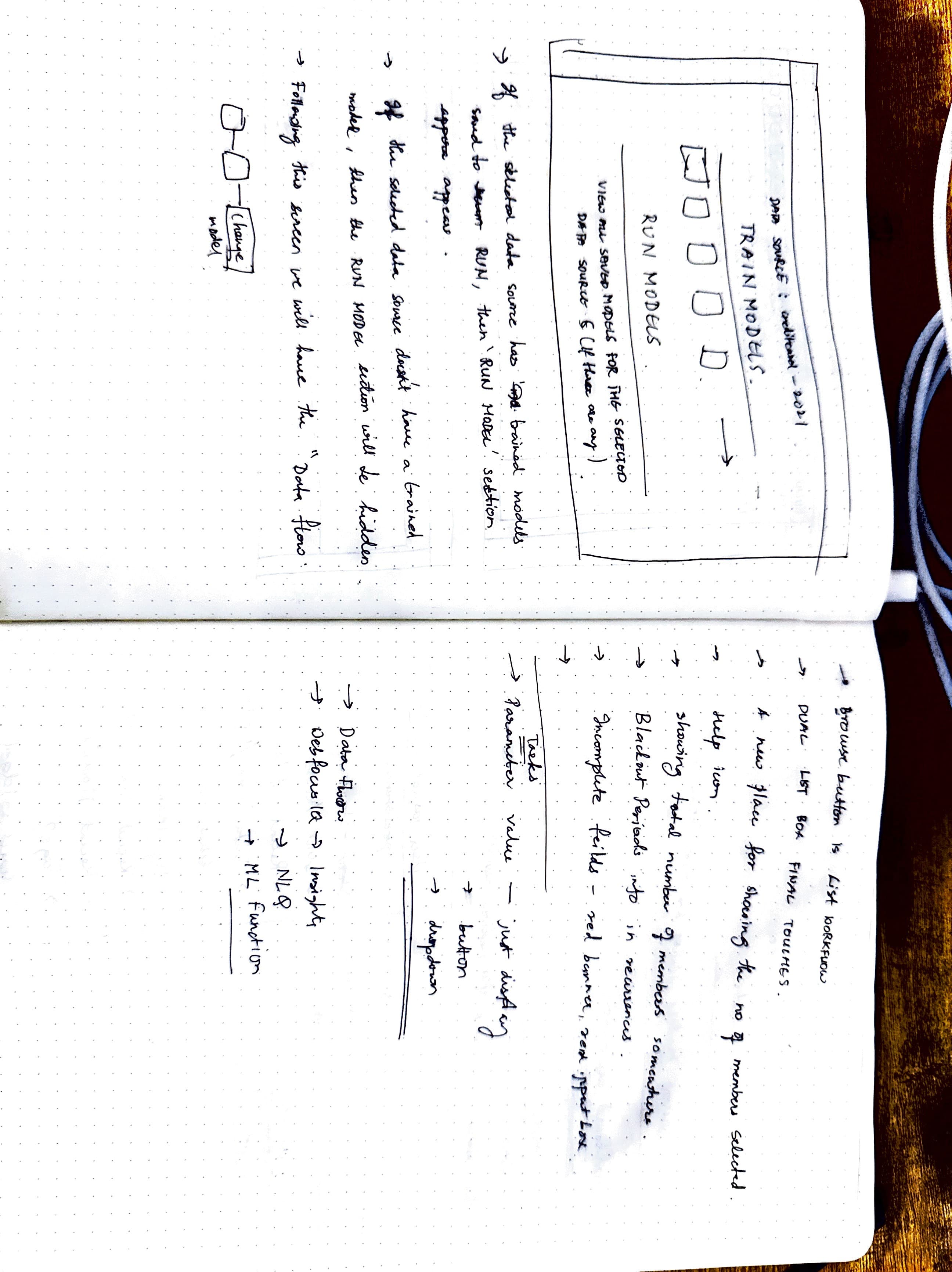
~15 clicks minimum just to see a trained model. Plus menu → data flow → drag dataset → drag model pill → hidden play button → cascading context menus for hyperparameters. Powerful tool. Nobody used it.
The Side Project That Started It All
I dug into why the popup was needed, how model predictions work, what feature importances actually mean. He was glad I took the effort in understanding.
▶Watch public explainability demoThe other designers I worked with before didn't really understand what they were doing — they just gave designs. But you sat with us, talked to us, and actually understood. That's why I trust you.
— Marcus Horbach, Principal Data Scientist
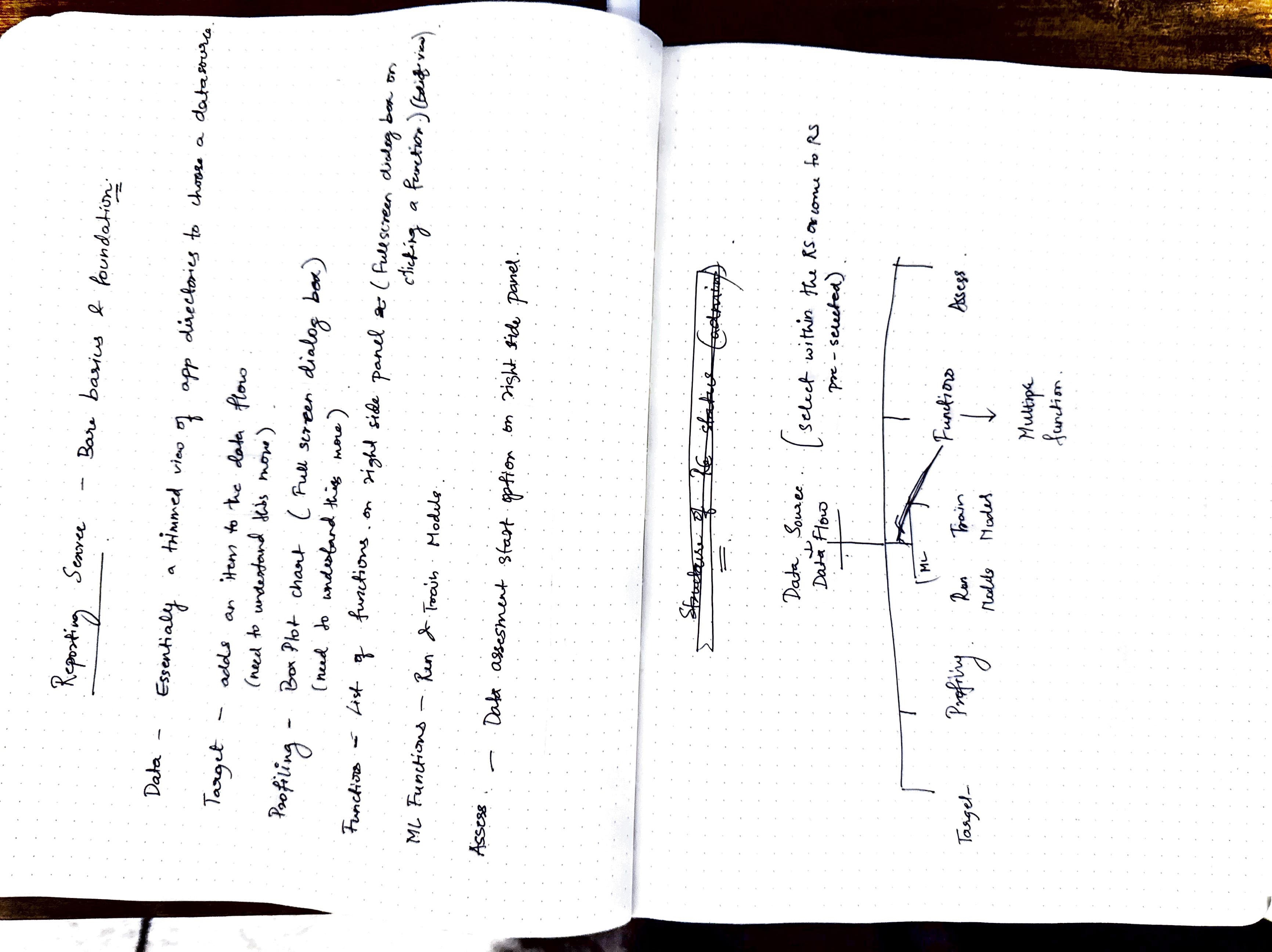
Legacy Pain Points
There was a big exclamation mark in a red circle, and the expression was red itself. It said ‘No model generated, please click on the play button to start training the model.’ So frustrating. That was the first thing I noticed, and it was the first thing I said — let's remove that messaging, please.
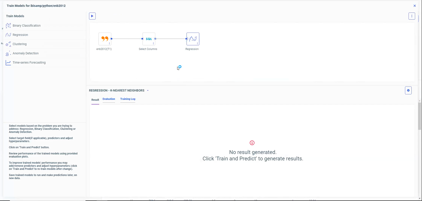
The dead-end: red exclamation mark, 'No result generated.'
You had the step navigation, you had the algorithm navigation, and inside algorithms, another level of tabs. Just for binary classification — 8 into 5 screens. That same structure applied to every model type.
Train model results — step nav, algorithm nav, and tabs within tabs.
The old ML workflow had the data flow canvas visible at all times. Split view — data flow on top, table view at the bottom. You didn't really need the data flow in the view. I had to ask the data scientist for repeated walkthroughs because I couldn't get the sandbox to work.
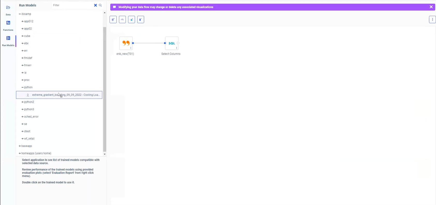
Run Models: data flow canvas on top, side data panel. Everything interconnected.
Data scientists wanted a technical workflow. I wanted something business users could actually use. The principal data scientist at one point was like, “Are you trying to make this dumb?” No. I wasn't removing sophistication. I was making the sophistication legible. We landed on one workflow that serves a dual purpose — not dumbed down, not over-engineered.
We used to talk about physics and books. I used to show him sketches — “Am I understanding this right?” I validated my understanding constantly because I was terrified of making something look nice while technically meaning the wrong thing. That would have been a fake win.
We had this conversation about chart colors — four different colors that didn't mean anything. I said, “Your goal is to show F1 scores. Adding colors makes it more confusing. You just want users to compare and pick the best one.” I won that conversation because I'd finally understood what the chart was actually showing.
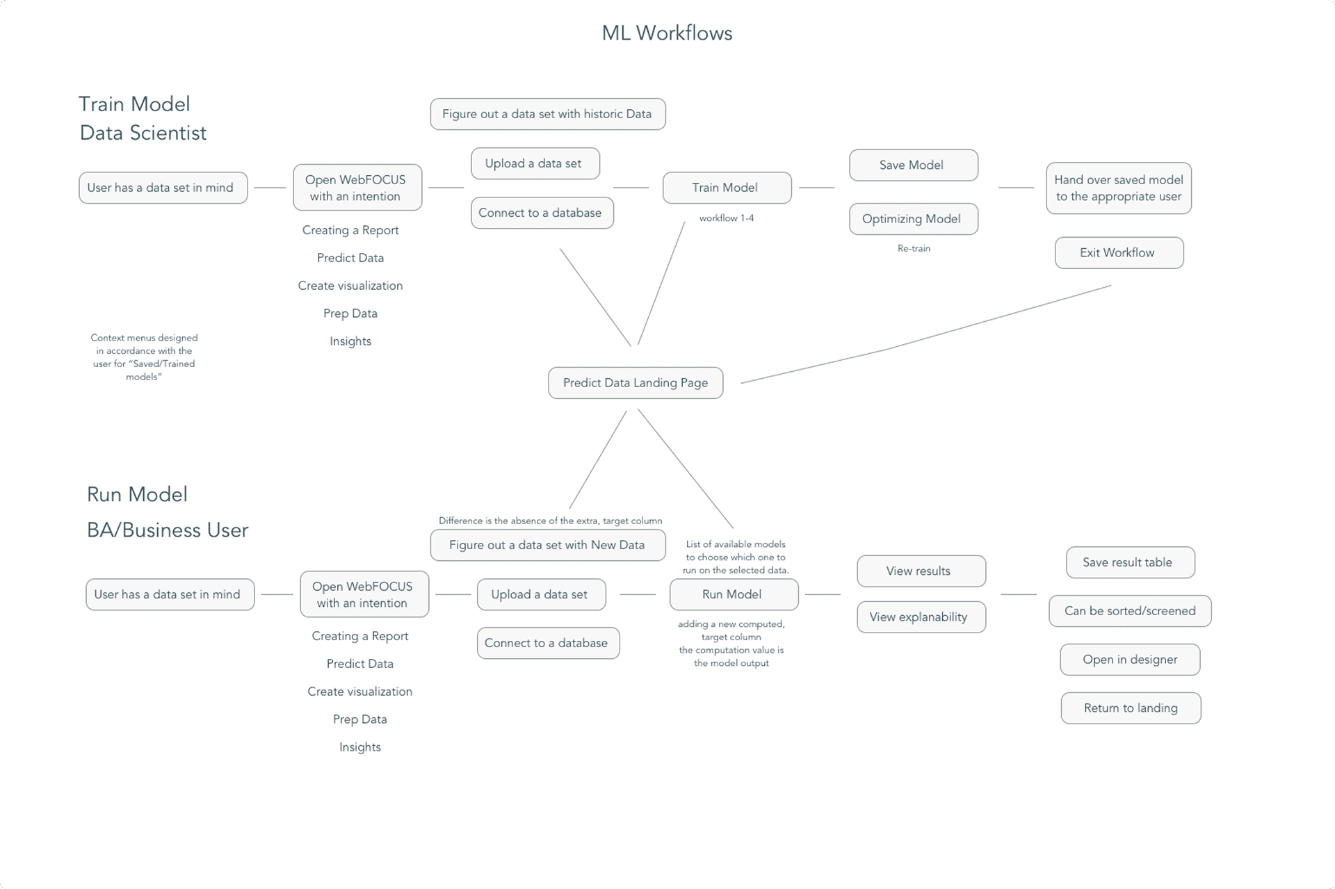
Persona Research
We did not have two experiences. We had one path that serves a dual purpose. Not easy enough that data scientists would say “this is spoon feeding,” but clear enough that someone like me could use it. Every step had context — definitions, explanations, tooltips. The sophistication was there; it just waited for you to ask for it.
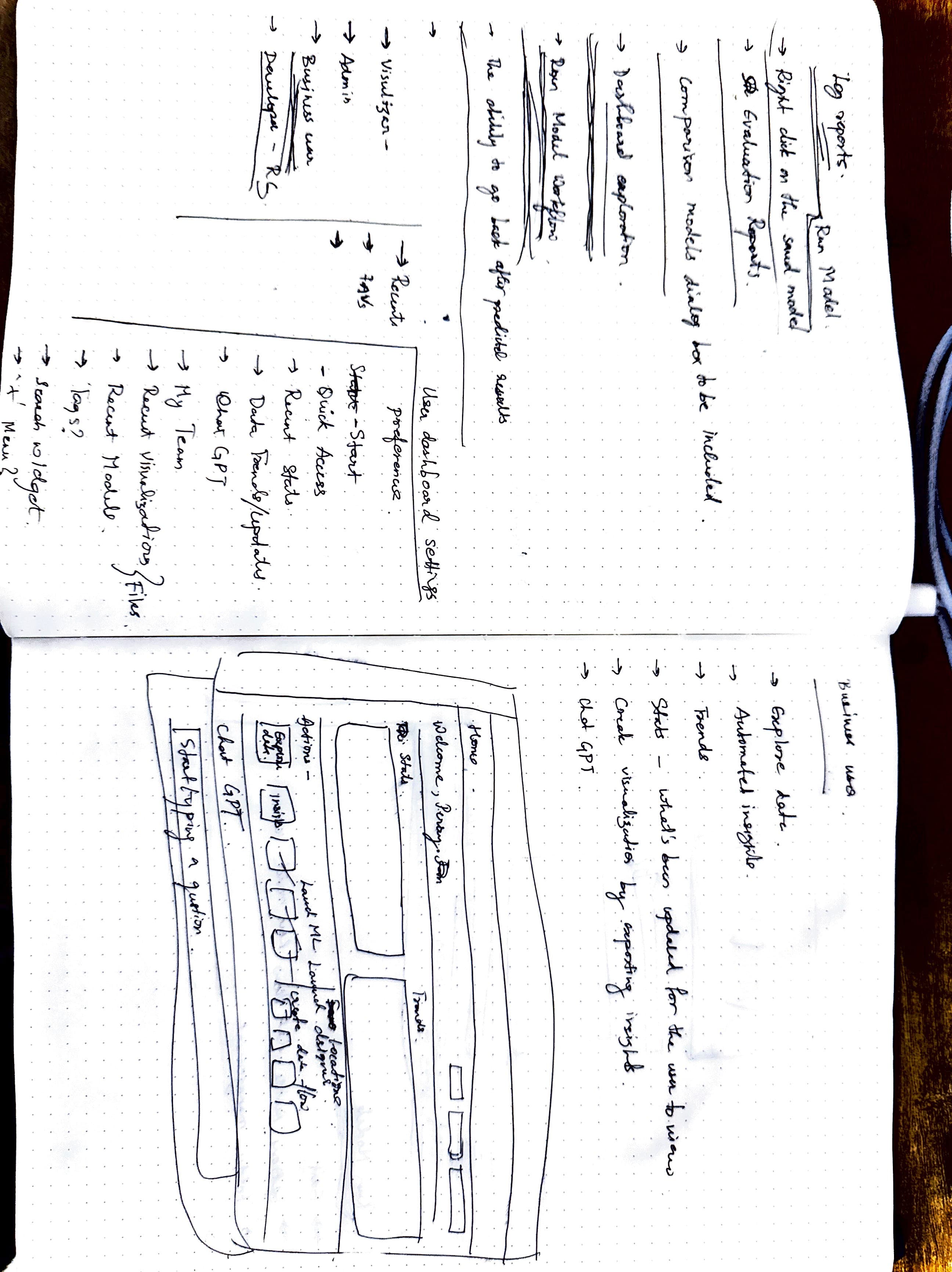
Architecture Mapping
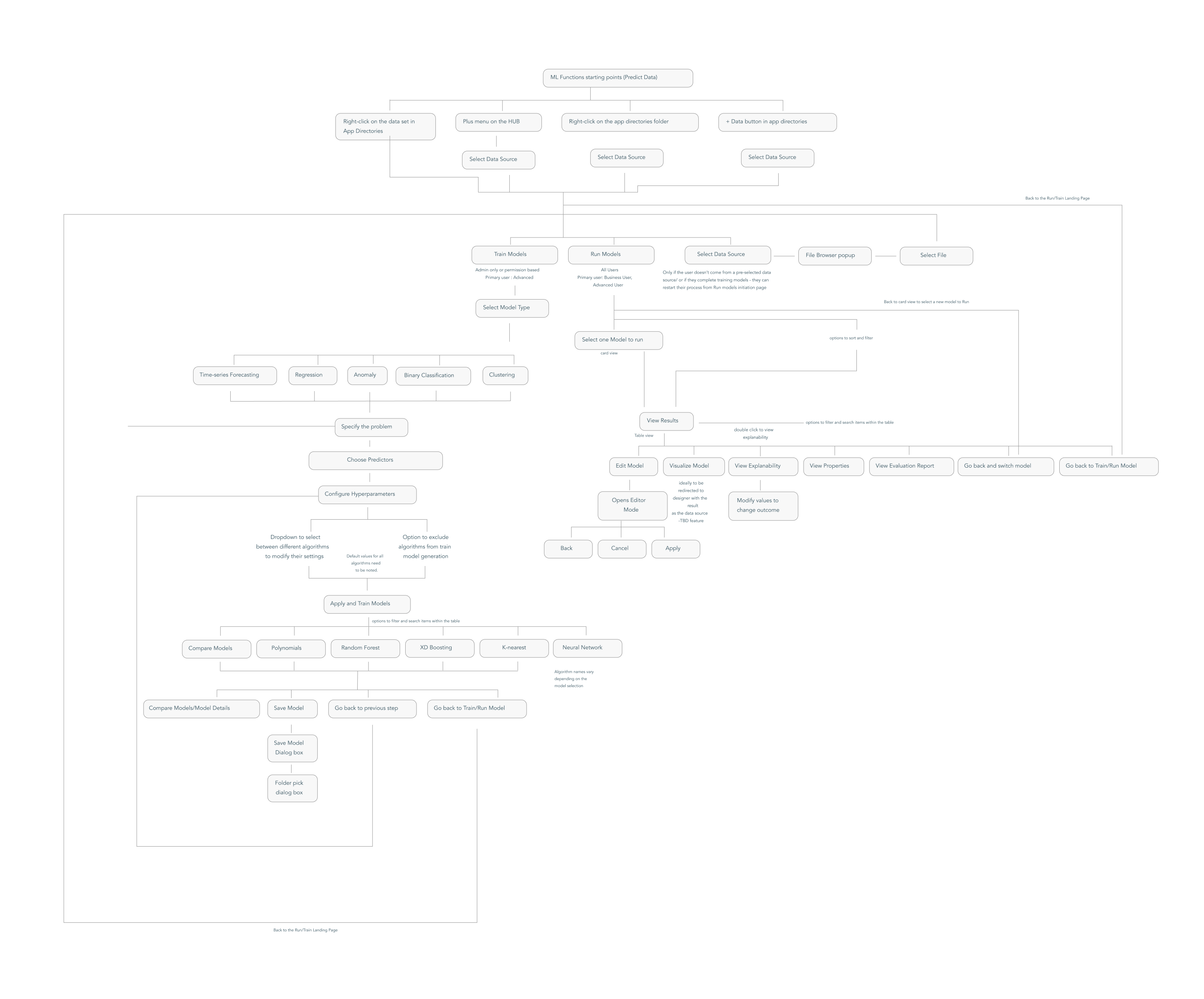
Full workflow mapping
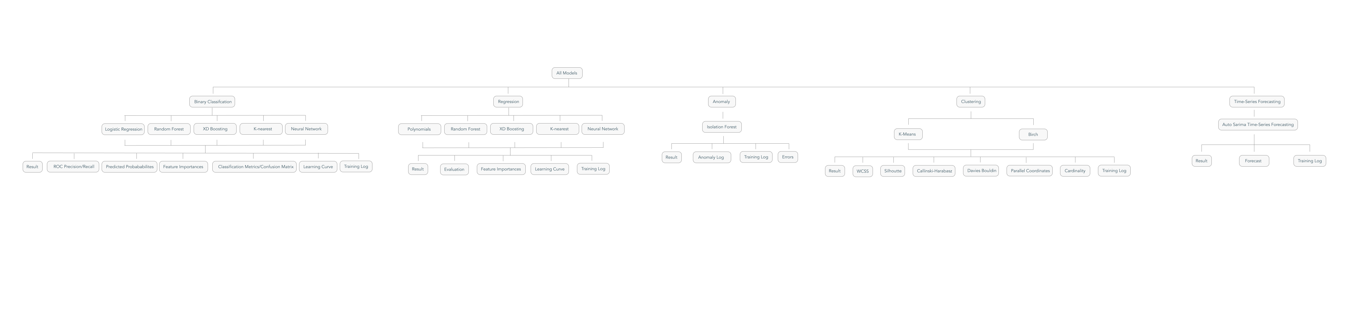
All model types architecture
Workflow paths mapped by persona
No Predict Data landing page existed. My first instinct was — why can't users select data themselves? I designed it from scratch, dozens of iterations, until the tab split became the answer.
Entry Point Design
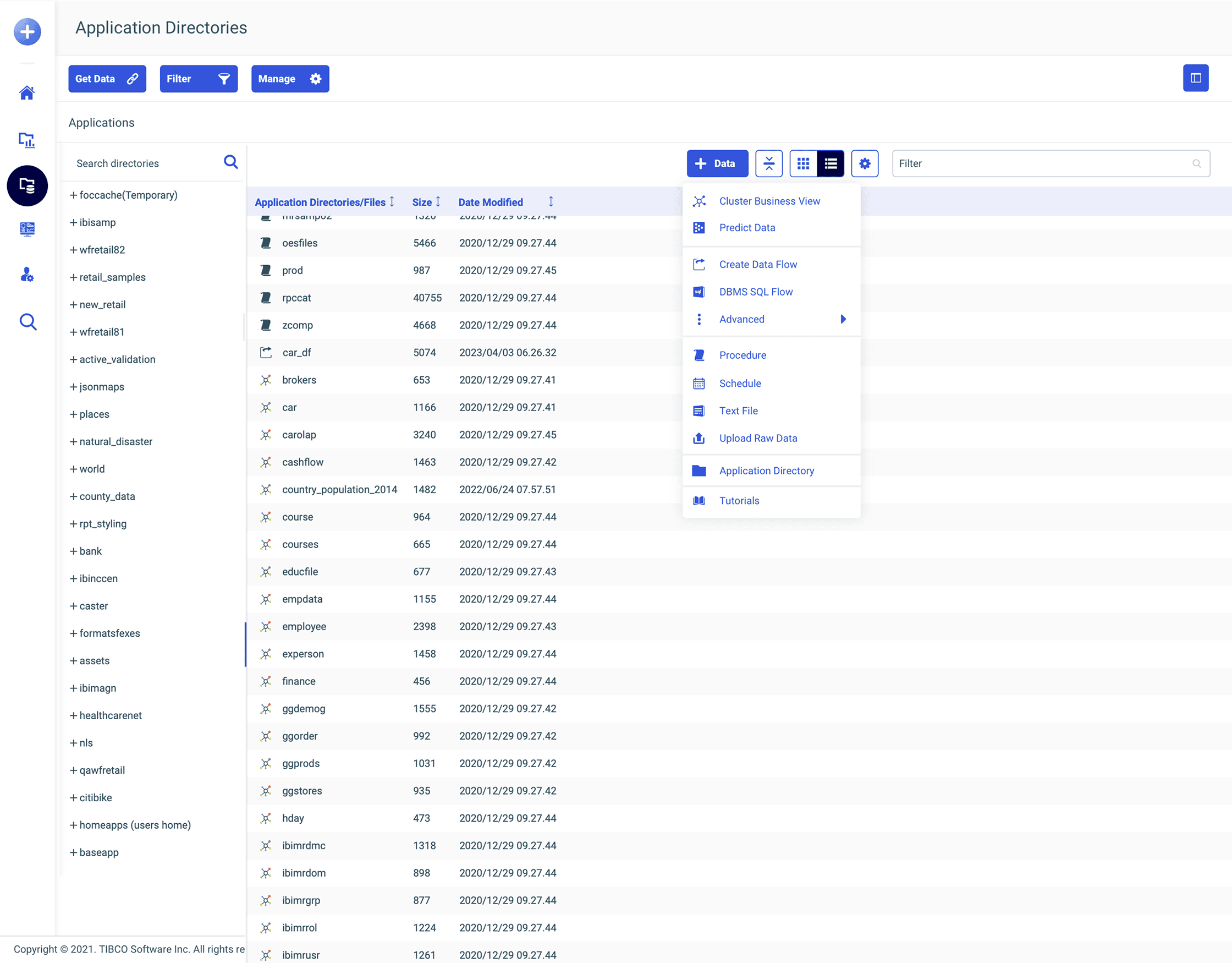
Right-click +Data button
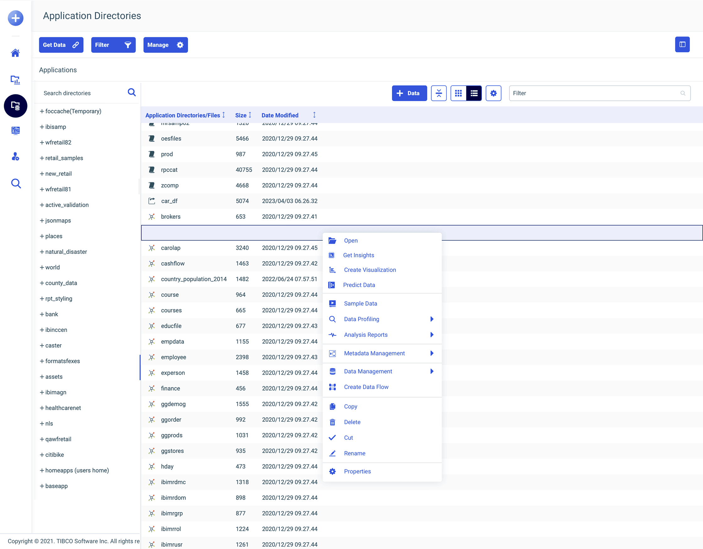
Right-click dataset
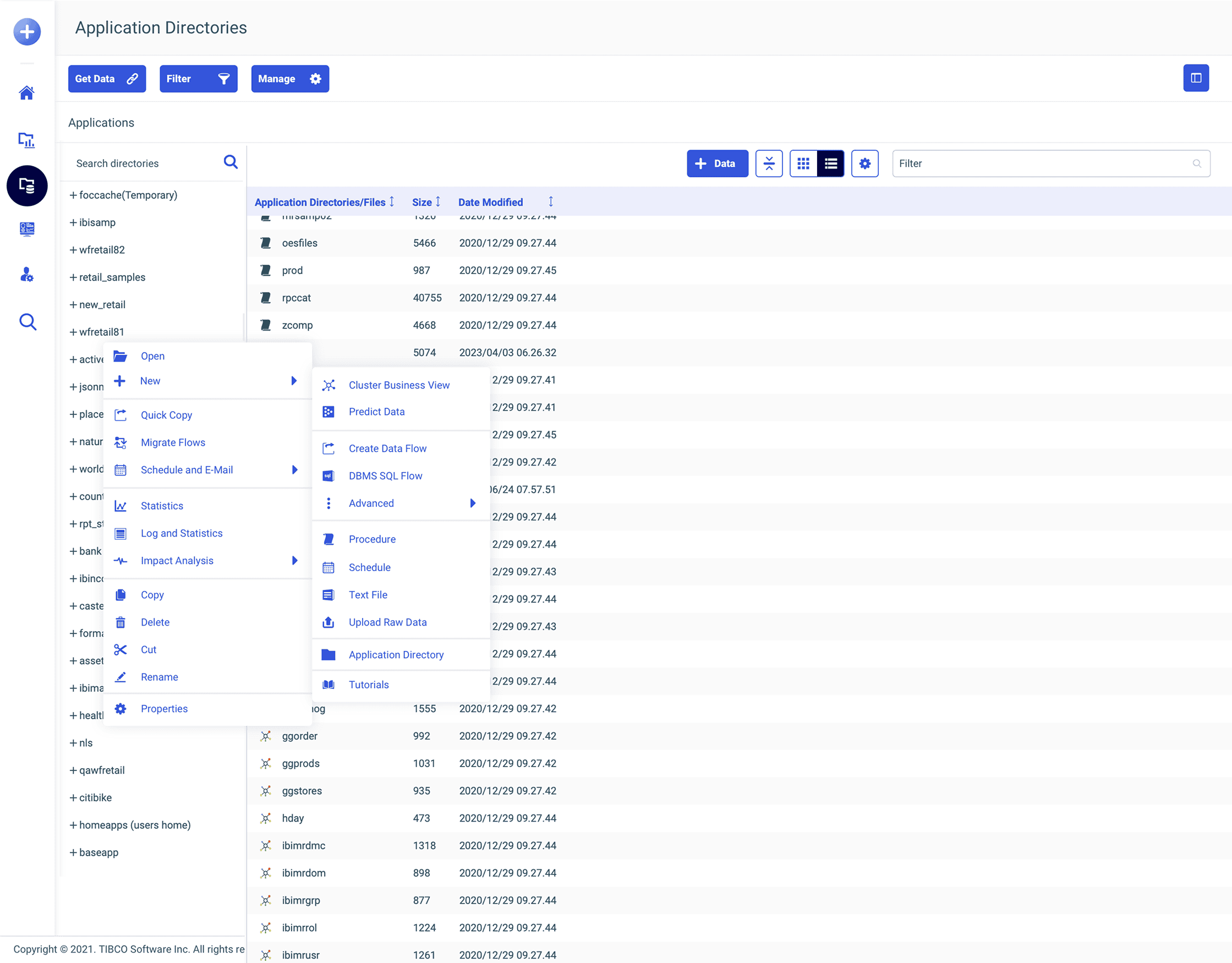
Right-click folder
In WebFOCUS, right-click is like religion. Everything is right-clickable. So putting “Predict Data” in the right-click menu of a dataset was the most natural thing. I was capitalizing on the most common user behavior in the product. Once we saw how well it worked, we extended the pattern to Generate Insights and Ask a Question too.
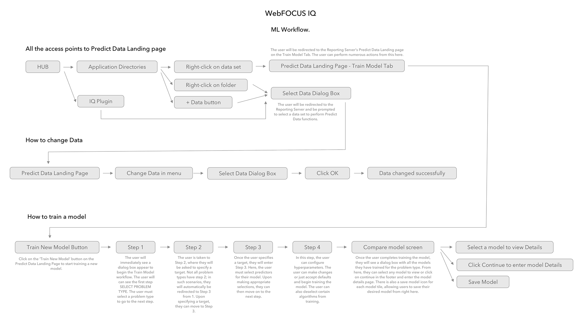
Initial workflow mapping
I tried full-screen views, side-step layouts, two-column layouts. The popup wizard won because WebFOCUS loved modals — all engineers lived in popups. It gave me breathing room for helper text and definitions. It let each step exist cleanly without the whole screen jumping. And it was faster to engineer. Sometimes the best design move is the one that solves the problem without asking the legacy product to become something it isn't.
The popup wizard — Step 1
Sketches & Process
The confusion matrix screen had two charts, a threshold slider, and a four-by-three table. When I first saw it, I couldn't make sense of it. So I sat with the data scientist — a dozen sessions, paper and pen — until I understood every single interaction.
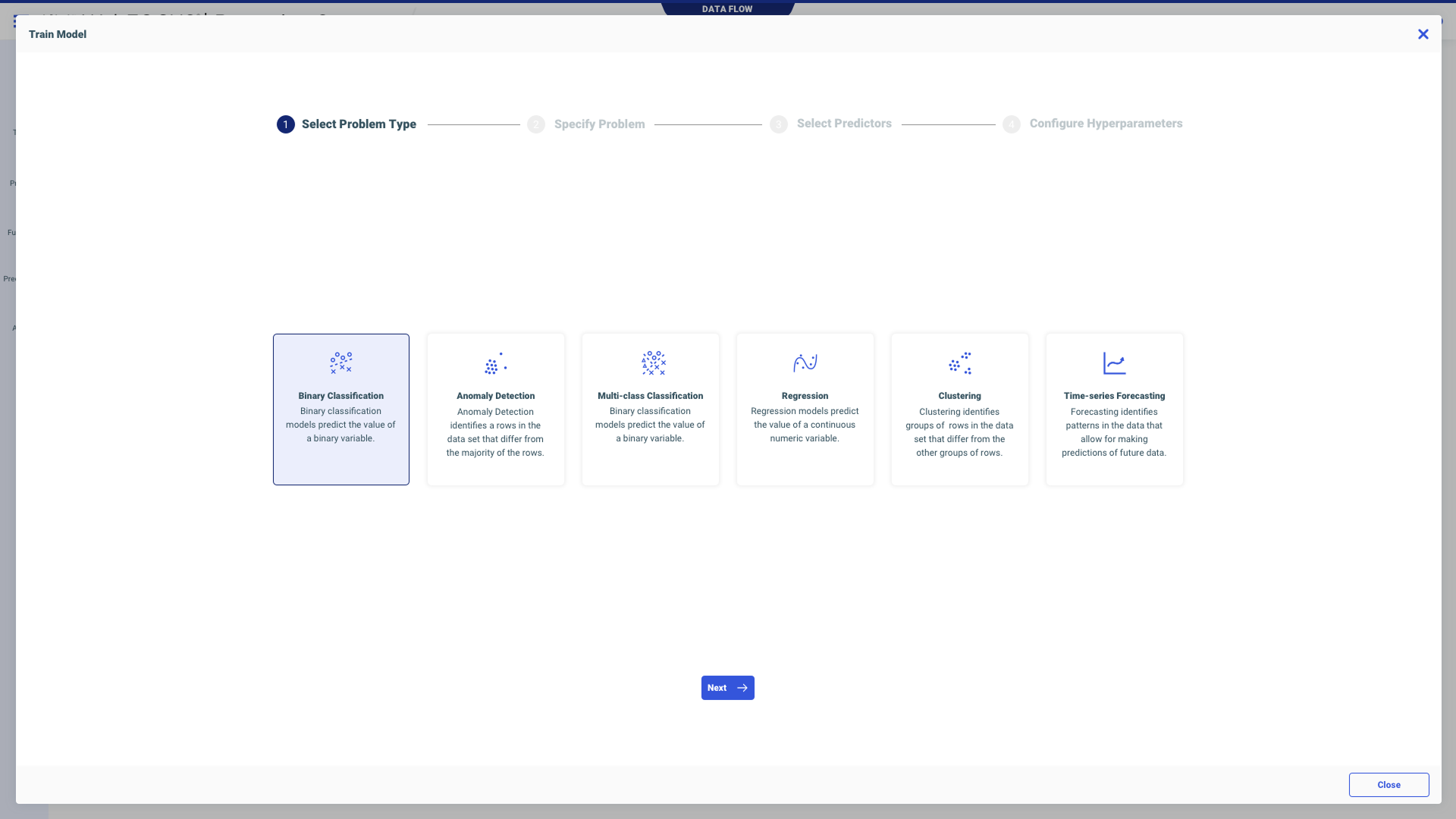
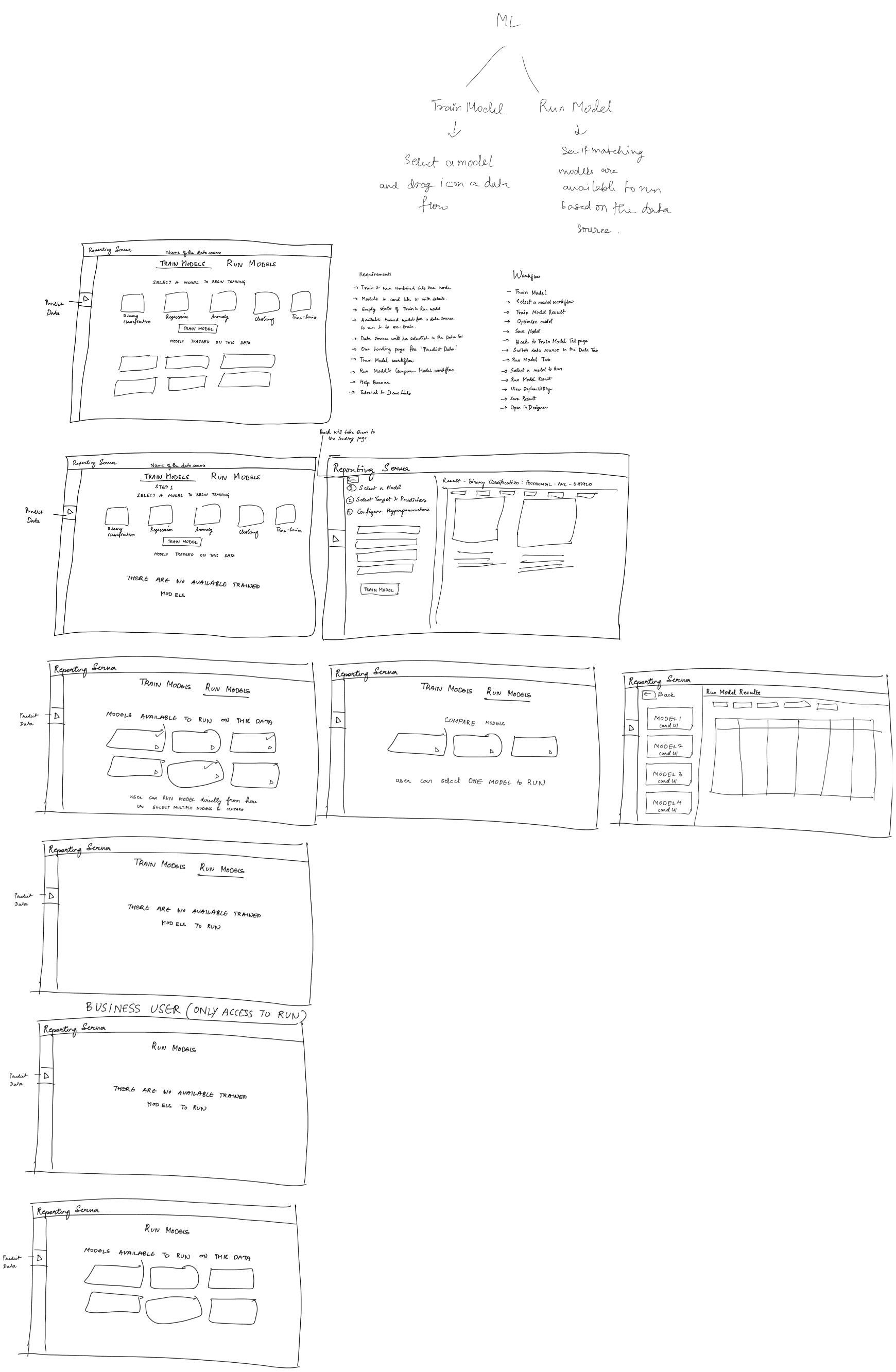
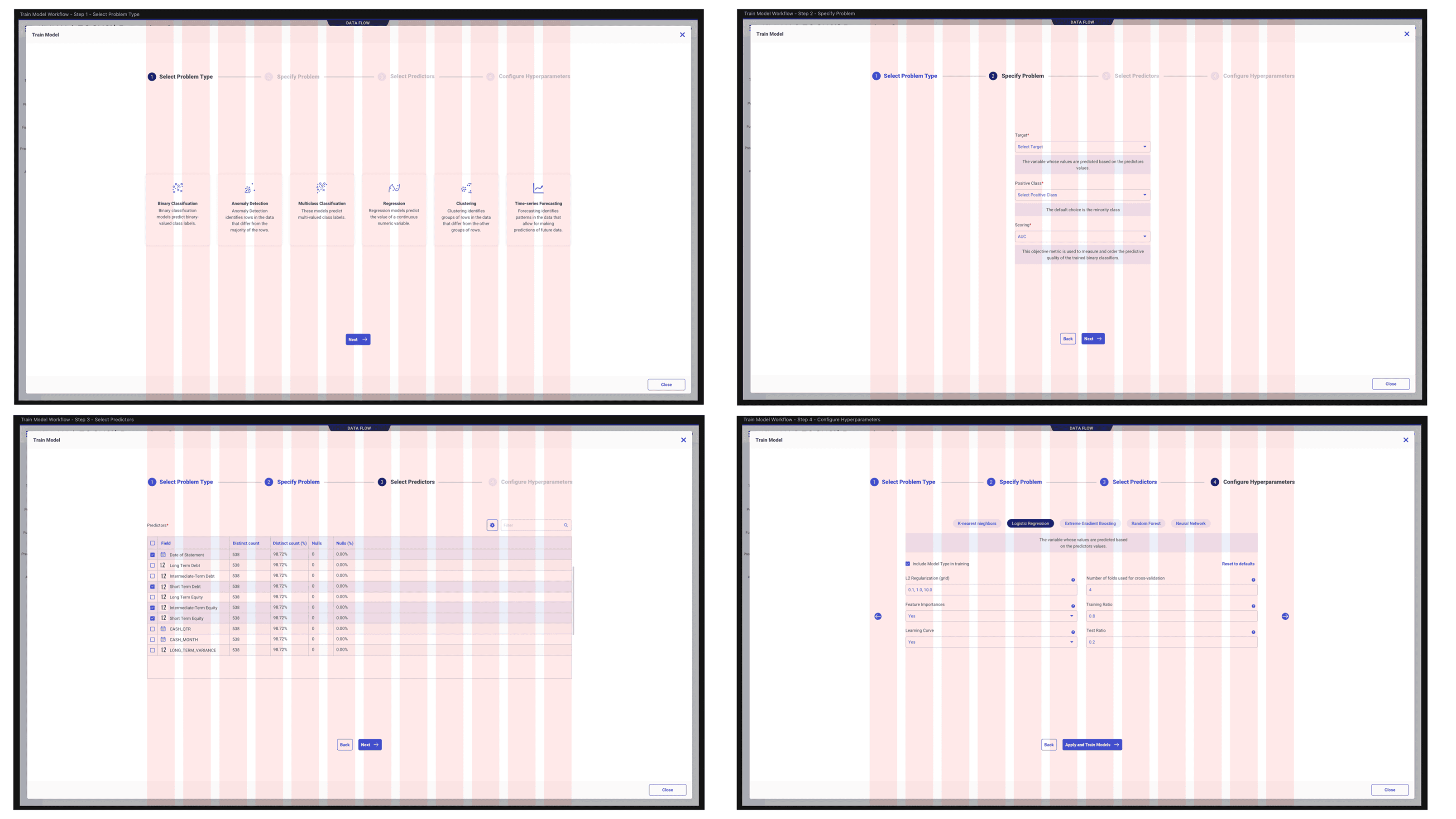
The Guided 4-Step Workflow
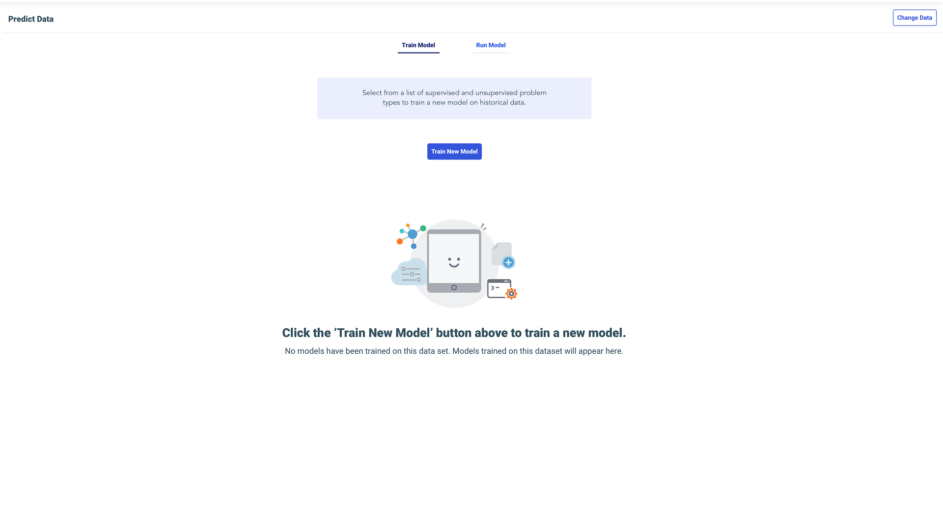
Entry point: Empty state with clear CTA
Step 1: Select Problem Type
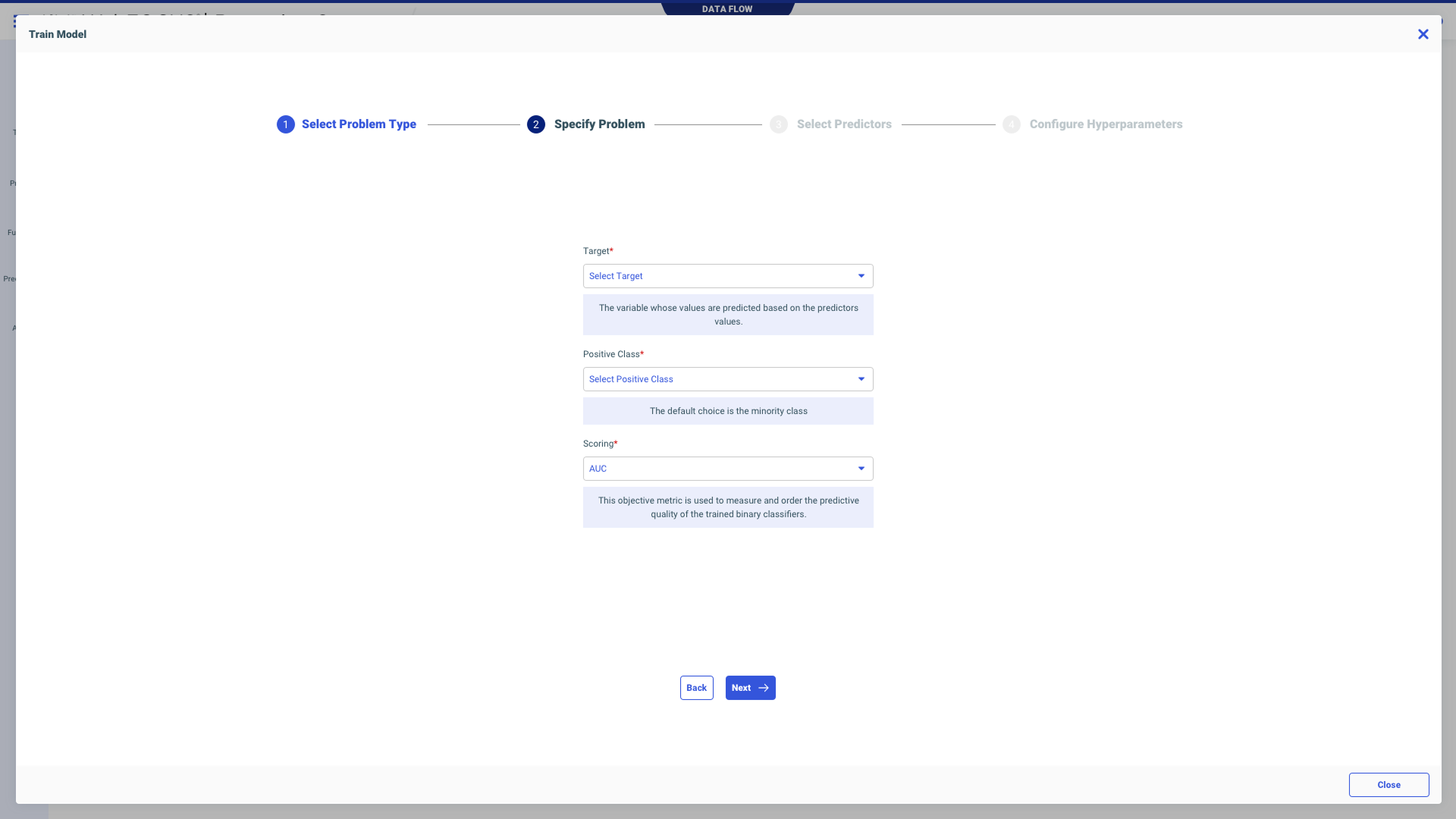
Step 2: Specify Problem Details
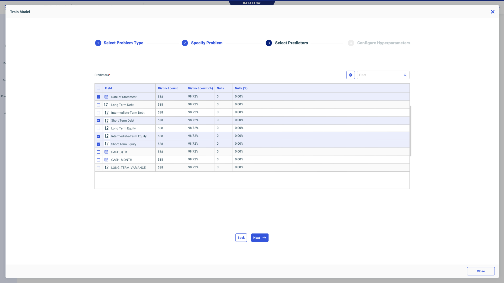
Step 3: Select Predictors
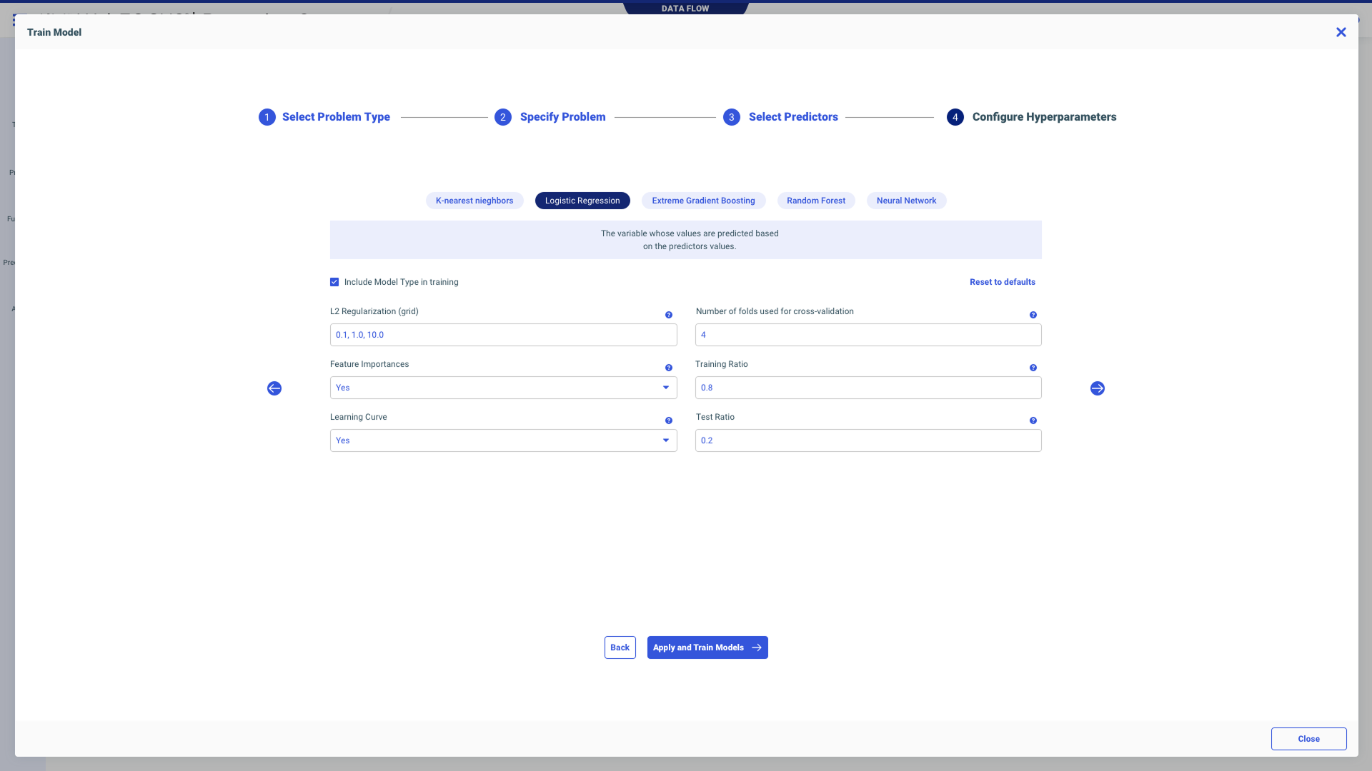
Step 4: Configure Hyperparameters
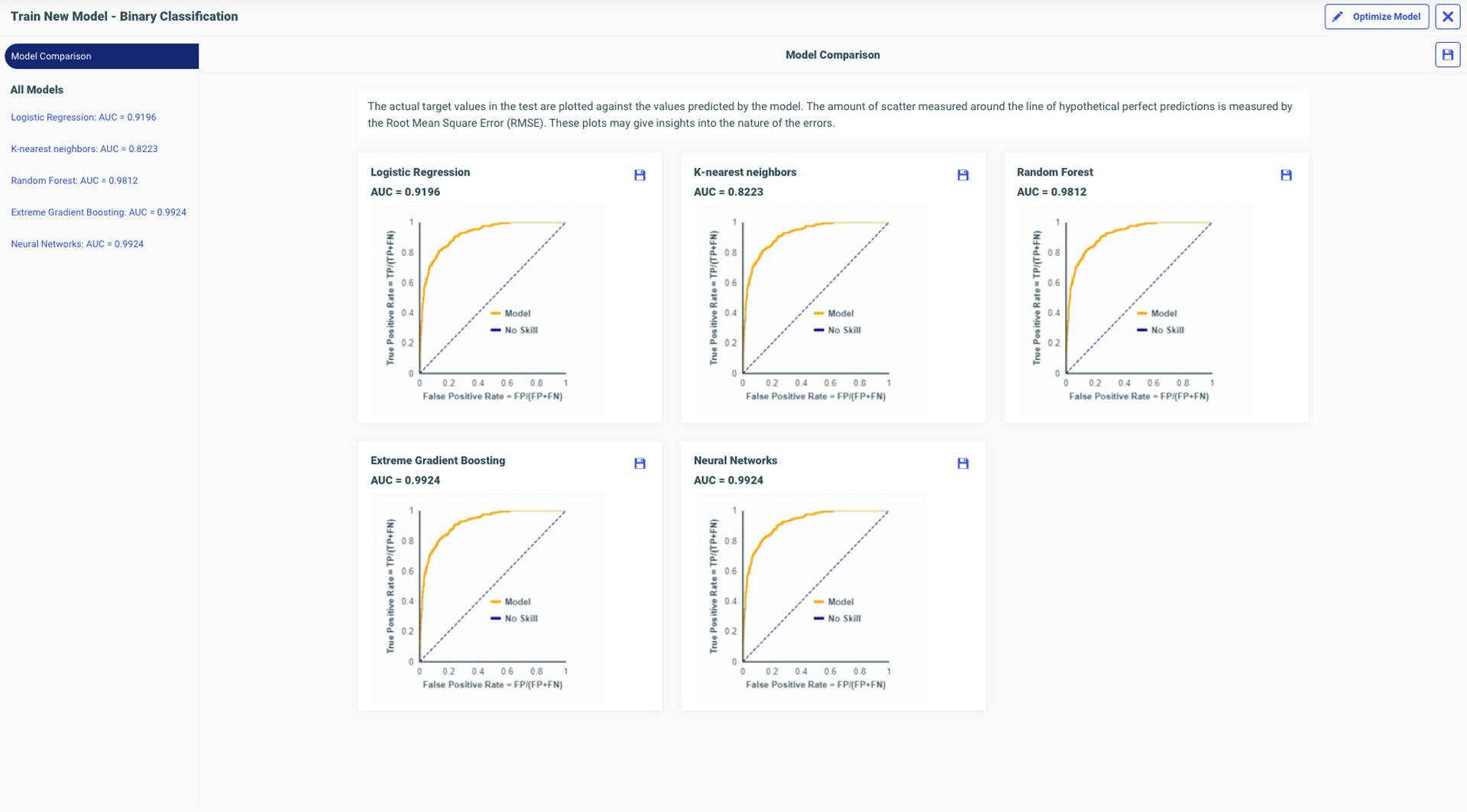
Compare Models — side-by-side evaluation
I aligned the threshold slider directly under the chart point that moved — exactly 90 degrees parallel. As you drag it, the dot on the line chart moves with it. There's no way you can miss the relationship. It was like magic. After understanding every interaction on every chart, I could finally explain it to somebody else visually.
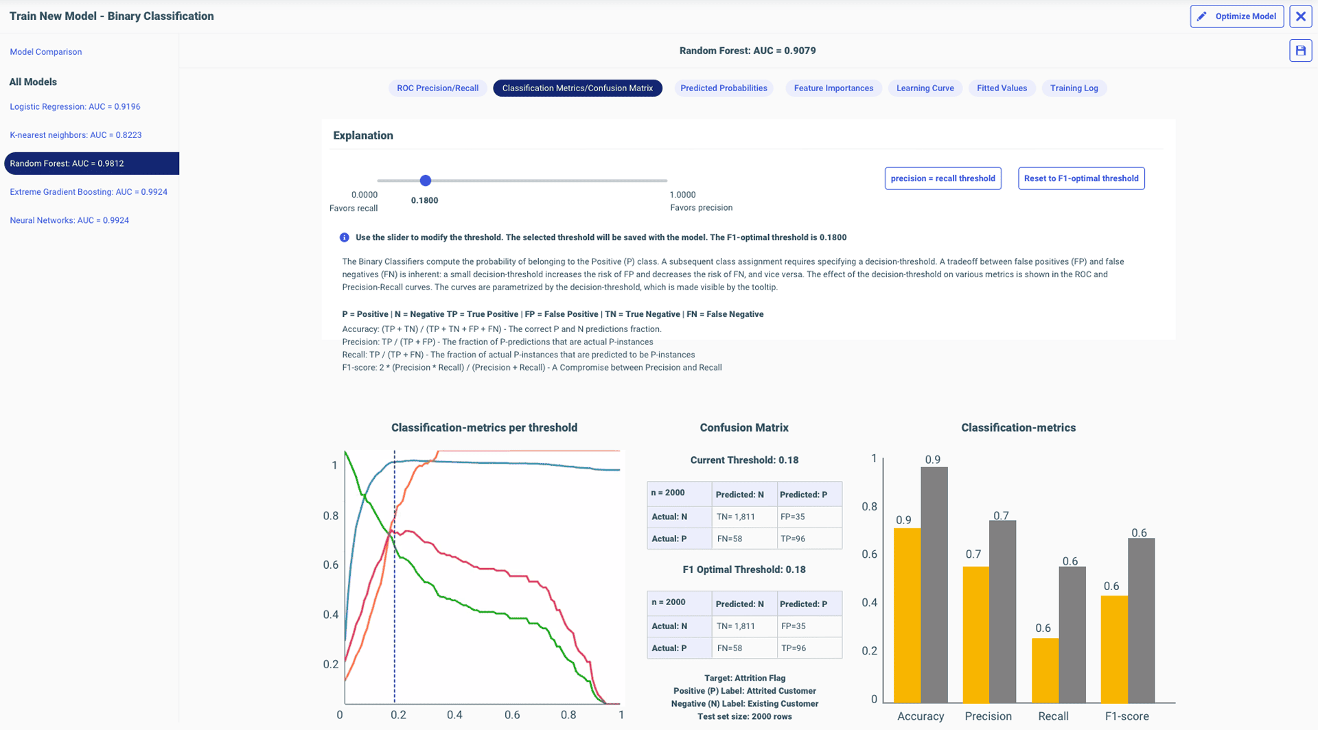
Threshold slider and chart point: exactly 90° parallel
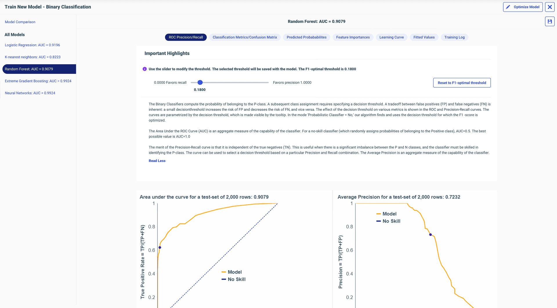
ROC / Precision curves
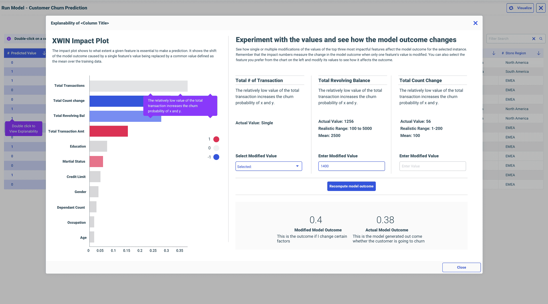
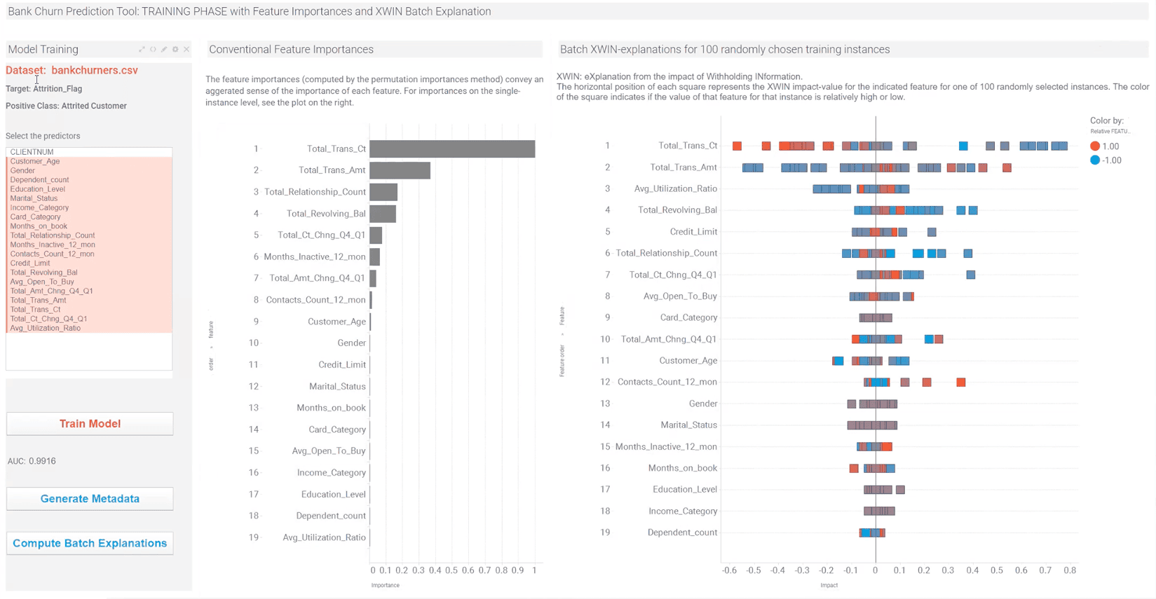
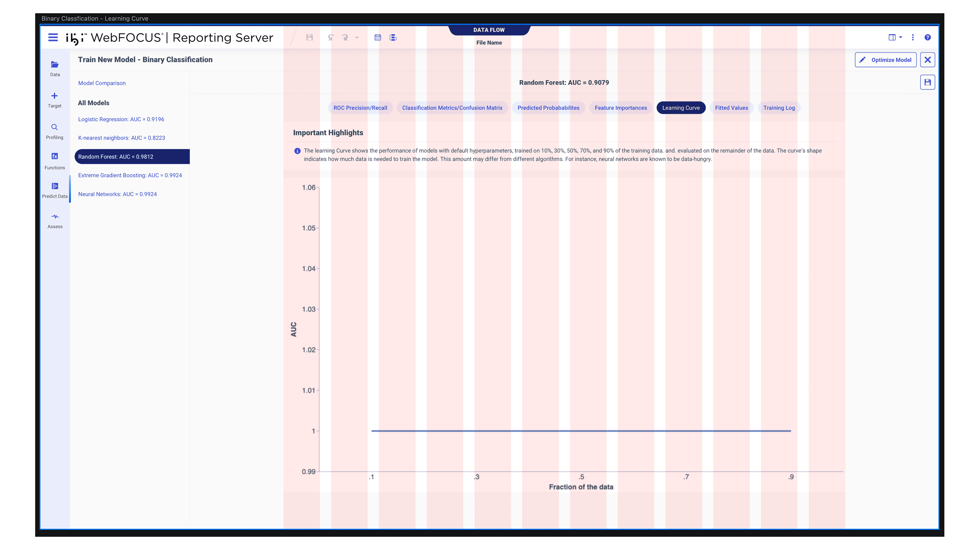
Native explainability — where it all started
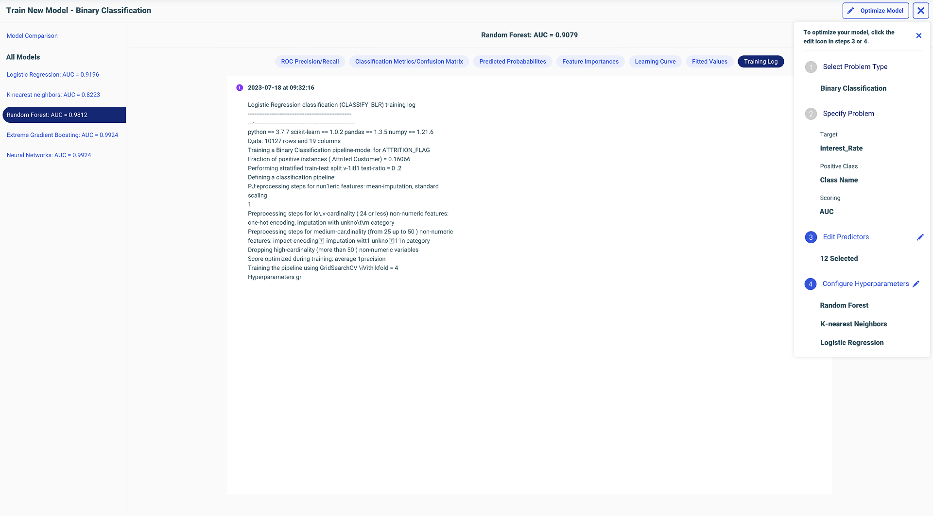
Optimize Model — with inline warnings
Full ML UI structure
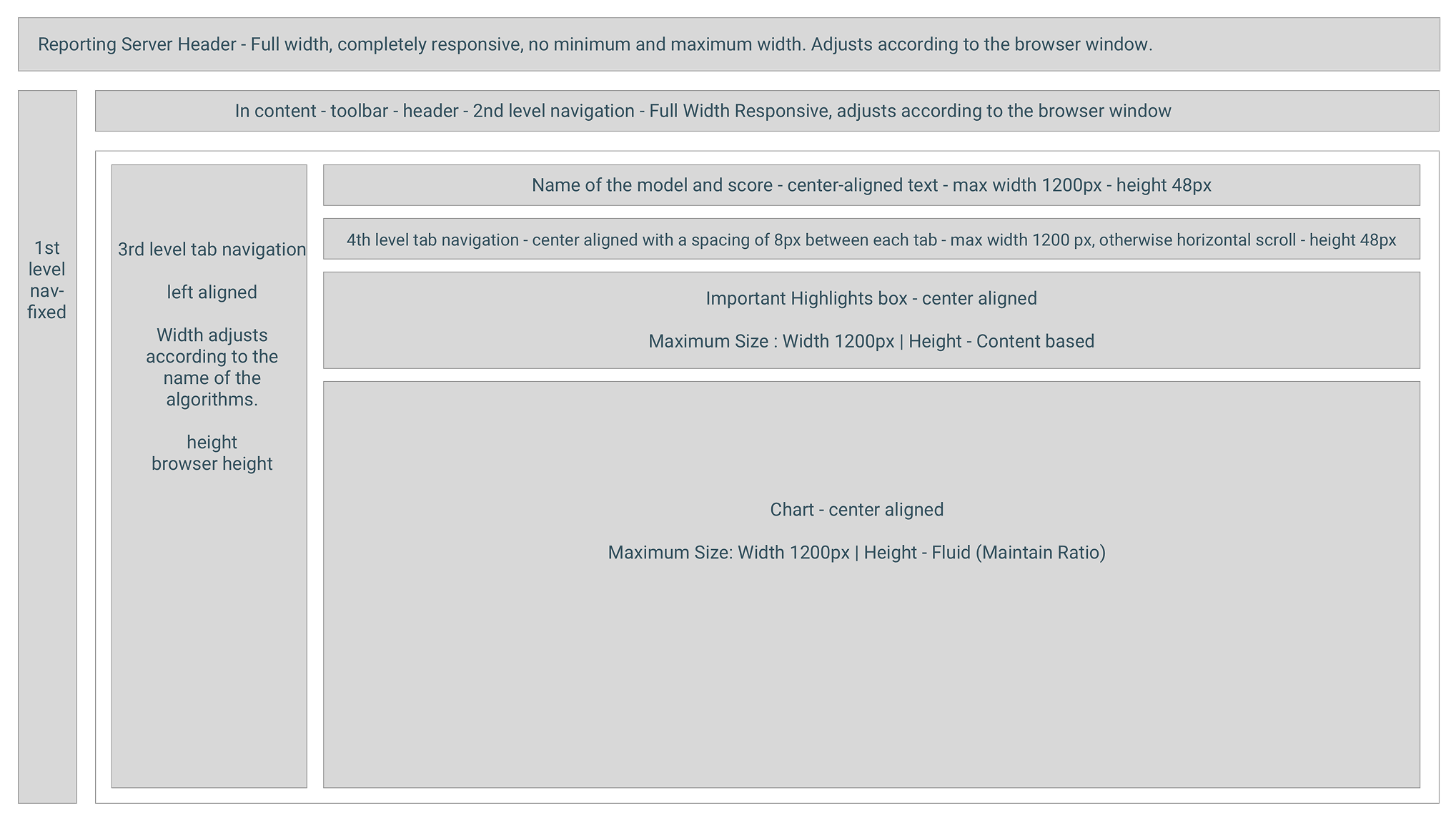
Styling & Structure Decisions
12 column grid system for wizard steps
Grid applied to training UI
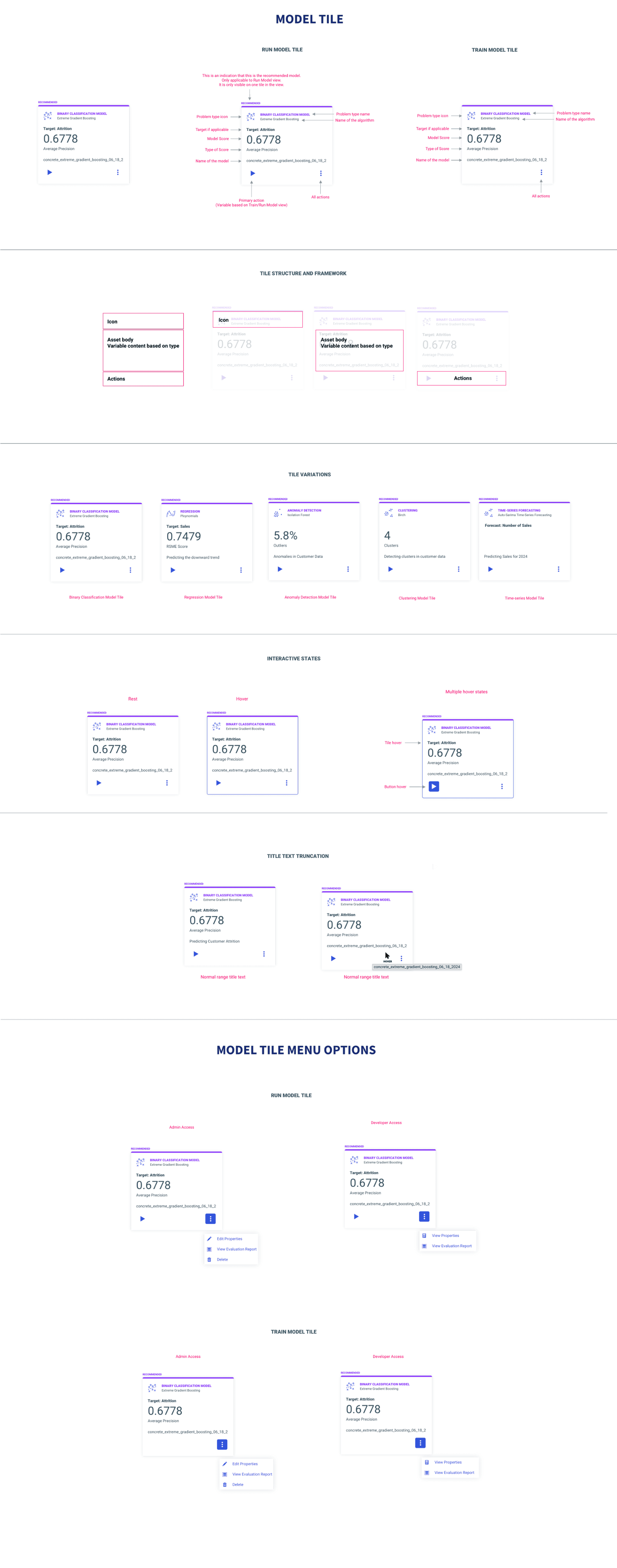
Model tile card spec
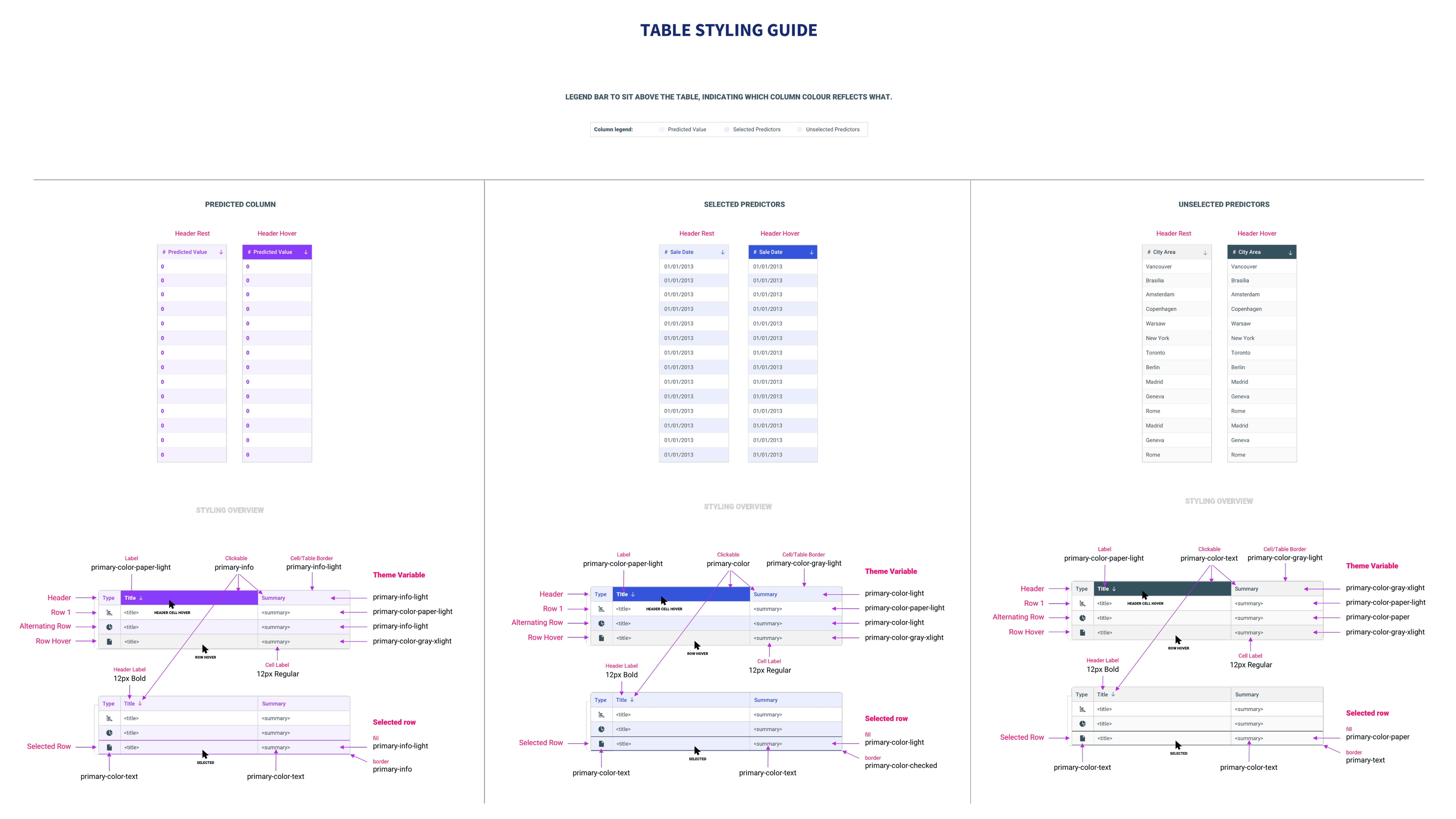
Table styling specification
Before / After Walkthrough
Legacy Workflow
Redesigned Workflow
I was the only designer on ML, on IQ, on Reporting Server. After the layoffs, it became four systems. I fought for every design decision with logic, not instinct.
I was the only designer to work on Reporting Server, on ML, on IQ. Nobody else touched these. I built a mental model of WebFOCUS as an end-to-end ecosystem: get data, prepare data, train and run ML, visualize in Designer, distribute through ReportCaster. Nobody explained that to me. I built it by working across enough of the system.
When the data scientist tried to bring Data Flow back into the view, I pushed back. I had recordings, notes, documentation from our earlier sessions. I reminded him of our prior decisions, explained why the change would hurt the workflow, and held my ground. The room was me, two directors of engineering, the head PM, the principal data scientist, and my design director. I won.
Defending my thinking forced me to depend on logic, not instinct. I always needed industry research, existing WebFOCUS behavior, documentation, or common sense to back up my decisions. I could never just say “I designed this because I felt like it.” Design instincts don't mean anything if you don't have the evidence to back them up. That made me sharper. That made me better.
Four SMEs. Separate sessions. I told them one thing: “It starts from the dataset.” They right-clicked, saw “Predict Data,” clicked it — and just blazed through the whole workflow. Because it was that obvious. The four-step flow was untouched by feedback. They had design suggestions on the results screens, but the core spine? Nobody questioned it.
Every SME completed the guided flow without assistance. My design director, who knew nothing about ML, was able to do it too. I taught him machine learning with this workflow. That was the real test.
Clicks to start. Right-click, Predict Data, done. The entry point I designed became how other AI features surfaced in the same menu — Generate Insights, Ask a Question. That wasn't just a UX tweak. That was adoption thinking.
ML Functions taught me product partnership more than anything else. With RC, I had to dig through chaos. With ML, my PM and I co-owned it. My input shaped the roadmap, the concepts, the direction. I only fully realized I was shaping the entire product experience after getting laid off and building these case studies.
“The clarity of her designs, in spite of the underlying data science and machine learning complexity, is impressive and has greatly contributed to the success of our products. Her design solutions are rooted in a deep understanding of the purpose of the product.”
— Marcus Horbach, Principal Data Scientist
“During a User Acceptance Test session, Anuja observed me navigating the screen. I was highly impressed with Anuja's approach. Her design was clean, intuitive, and clearly addressed the needs of users across different skill levels.”
— Anita George, Principal Account Tech Strategist
Live Brainstorming from Week One: If I had started the live working sessions — paper, pen, sketching inside my design software on video calls — from week one instead of halfway through, we would have saved sprint cycles. Brainstorming together inside my tool, not as separate handoffs, was the breakthrough workflow.
There's always room for improvement: Graying out incompatible models before users ever try them. Simplifying the results screen even more. Automatically letting users enter run model mode from training — no context tab switching. I pushed hard for what mattered. When technical constraints blocked something, that was technical reality, not lack of conviction.